

The number of Facebook ads published every day is absurd and the budget spent by marketers on Facebook advertisements is overwhelming.
Digital Marketing experts estimate that Americans are exposed to around 4,000 to 10,000 advertisements per day. What do you do to NOT be just another contributor to the landfill?
While having a good design will draw attention to your Facebook ad, the CTA is what will increase conversions and convince people to click and take action.
Spending a little time crafting your Click To Action button can make a significant difference to your conversions.
But what’s the best CTA for your Facebook ads to stop people dead in their tracks and increase your clickthrough rate?
We invested $1,000 to run an experiment and find the scientific answer. And we discovered that…
Although Facebook advertising can be very useful for general brand awareness, most of the time, we want to deepen the relationship with the prospect or customer by getting them to take action.
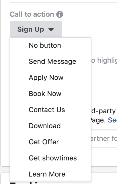
To help with this, Facebook provides a range of call to action (CTA) buttons for ads and pages.
There are approximately 20 different options, from the general “learn more” to more specific ones such as “shop now” for e-commerce, “see menu” for cafes and restaurants and even “get showtimes” for movie theatres.

What we wanted to discover is:
- Do CTA buttons help or hinder ad performance?
- How much difference does the selected option actually make?
- Should we go for a soft option such as “learn more” or something more direct like “download”?
To take the guesswork out of advertising, we ran another AdEspresso $1,000 experiment to find out what really works when you put real ad dollars behind an A/B test.
What’s the Best CTA for Facebook Ads?
Experiment Setup
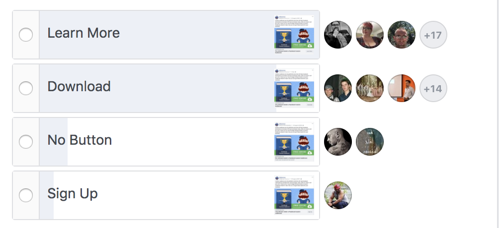
We wanted to test four different CTA options:
-
No button
-
Learn more
-
Download
-
Signup
To make the test “scientific” and its results meaningful, we needed to eliminate as many variables as possible. So we basically created one single Facebook ad and copied it four times, changing only the CTA button.
The other details of the campaign are:
- Budget:
Each ad was placed into a separate adset so that we could control the budget and each ad spent $250 over the course of 11 days. With four ads that resulted in a total campaign budget of $1,000. Lifetime budgeting was used. - Bid strategy:
Lowest cost without cap - Placement:
Mobile newsfeed - Audience:
US 1% Lookalike based on a seed audience of leads.
Current leads and website visitors in the last 180 days were excluded to prevent subscribers from seeing the ads. - Optimization:
We optimized for conversions based on a lead pixel placed on the thank you page.
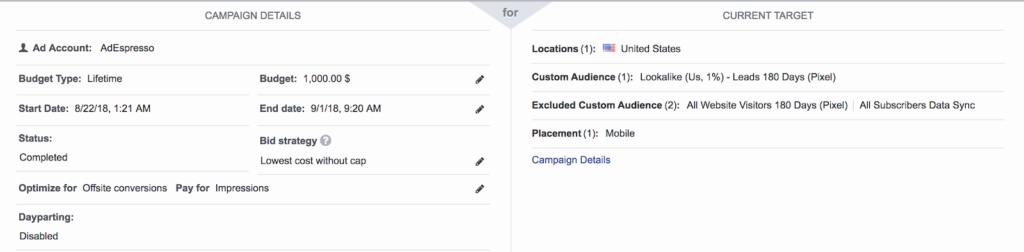

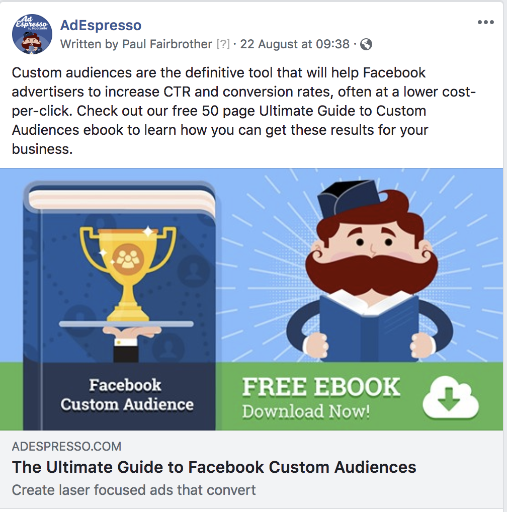
We ran a Conversion campaign to promote our free Custom Audiences Ebook.
Here you can see the four ads that we used:

NO Button version
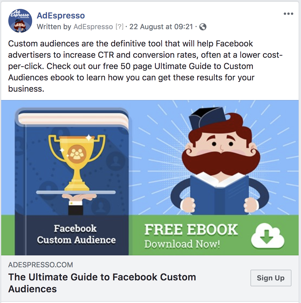

Sign Up CTA

Learn More CTA
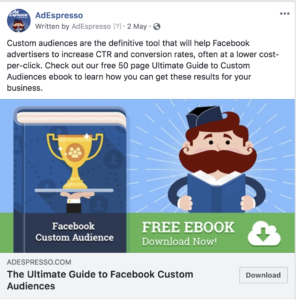

Download CTA
Once the users clicked on the ad, they landed on this landing page:
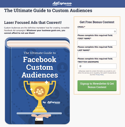

Once the users entered their details, this page sent them to a thank you page where the guide could be downloaded and the lead pixel was fired.
The lead pixel was what we tracked for our cost per lead.
Best CTA for Facebook Ads – The Hypothesis
We weren’t sure if the softer approach of Learn More or the more direct approach of Download/Sign Up would work best, so we polled members of AdEspresso University.
Learn More came out just ahead of Download in the predictions:

Both the AdEspresso team and most AdEspresso University members predicted that any button would work better than not having a button at all.
Best CTA for Facebook Ads – The Results
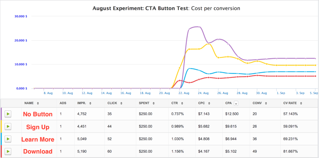
We created a graph in AdEspresso to analyze the results.
As we can see from the results table both the click-through rate (CTR), the cost per click (CPC) and the conversion rate (number of clicks to number of conversions) contributed to the cost per lead.

-
No button: 20 leads at $12.50 each
-
Sign Up: 26 leads at $9.62 each
-
Learn More: 36 leads at $9.94 each

-
Download: 49 leads at $5.10 each


The best call to action buttons got more clicks and also more conversions once clicked
Best CTA for Facebook Ads – Conclusions
The results prove it beyond any doubt:
Not having a CTA button can increase the cost per lead by nearly 2.5 times.
Any choice of CTA button worked better than having none at all.
Why did “download” work best in this instance?
It’s likely that the ad provided enough information for the user to make a decision and then “download” gave the indication that they just needed to click through for a quick and easy download.
“Learn more” could have conveyed to the user that they then need to read more which could be time-consuming.
“Sign up” could make users think that they have to enter their credit card details or hand over lots of personal details in a complicated form.
Finally, NO Button doesn’t give any call to action and the post could be confused with a standard page post that might not contain an offsite link: it isn’t clear that you can click on the image to be taken to the website.
Best CTA for Facebook Ads – Final Thoughts
Perhaps you’ve had a top graphic designer working on your images and have got a specialist copywriter to craft your ad text but your ads could still fail if you don’t get the CTA button right.
Every small detail on a Facebook ad can have a huge influence on the results so nothing should be overlooked.
To be clear we’re not saying “download” is always the best option to pick, it will depend on the offer, the stage of the funnel and how much information the user needs before making a decision.
For example with e-commerce sometimes we see “purchase” work best and other times “learn more” depending on how complex or well known the product is.
Takeaway Message: Test As Much As You Can!
It doesn’t matter if you prioritize testing images or text first, but once you have them dialed in, test the CTA button in the last round of testing.
That one extra test could save you hundreds or even thousands of dollars a year.